
OUXI.BE
The official Belgian storefront for OUXI electric fatbikes — designed and built end-to-end, in Dutch, for the Belgian and Dutch market, from the product catalog down to the delivery network.
Visit ouxi.beTry asking
What OUXI.BE is
Electric fatbikes, sold direct — factory pricing, pre-assembled delivery, official Belgian retailer status.
OUXI.BE is the official Belgian retailer for OUXI, a global electric fatbike manufacturer with 250,000+ bikes sold across 55+ countries. The storefront sells three models — the V8, V8 Dubbel, and H9 Offroad — direct to consumers in Belgium and the Netherlands, pre-assembled and delivered ready to ride, with pricing from €1,299 to €1,499.
What we built
The product already had global scale. The site had to earn local trust and make a €1,300+ purchase feel low-risk.
A proper storefront for an import brand
OUXI is a global fatbike manufacturer — this build gave it a direct-to-consumer e-commerce presence for Belgium and the Netherlands, with a full product catalog, cart, and accounts, instead of a single-page reseller listing.
A model comparison tool
The "Vergelijk modellen" page lets buyers weigh the V8, V8 Dubbel, and H9 side by side on price, range, and suspension before they choose — reducing pre-sale support questions on a considered €1,300+ purchase.
Hybrid delivery, built into the funnel
Nationwide home delivery sits alongside free local pickup points in Brussels and Maastricht, so the checkout flow itself removes the shipping-cost objection for buyers close to a pickup location.
Borrowed proof for a newer storefront
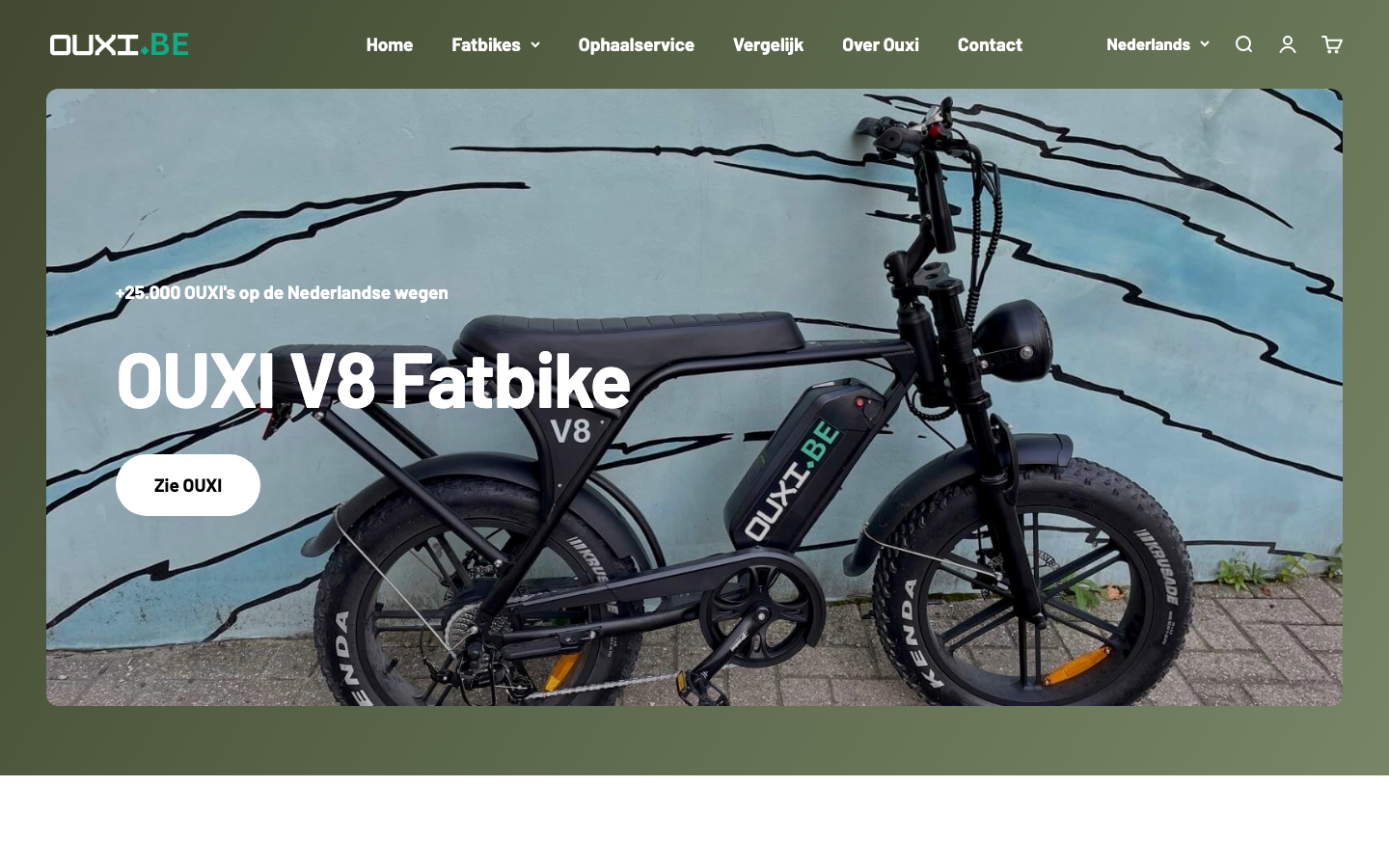
The homepage leads with "+25.000 OUXI's op de Nederlandse wegen" and the brand's global sales figures — lending an established manufacturer's scale to a Belgian storefront that's earning its own trust.
A closer look
From the proof-led homepage to the comparison tool that does the sales rep's job.
The homepage leads with a real product shot and the "+25.000" trust stat before any price appears.
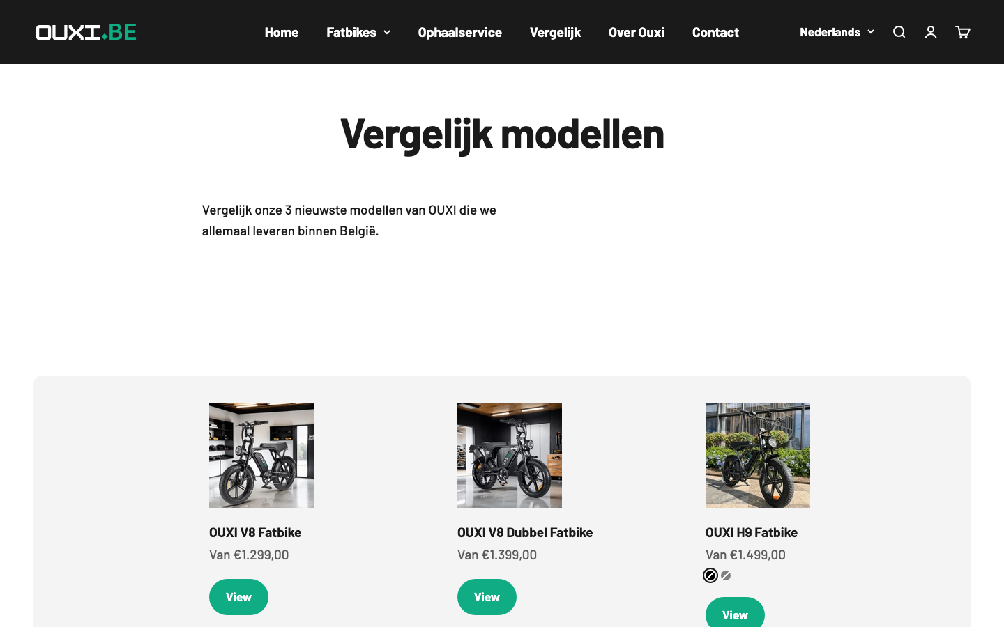
The model comparison page — one purchase decision, three real products, side by side.
25,000+
OUXI's on Dutch roads
3
Models compared side by side
65 km
Max range (H9)
The approach
- Borrow scale where the brand already has it. A Belgian storefront doesn't need to build trust from zero when the manufacturer already has 25,000+ bikes on Dutch roads — the homepage puts that number above the fold, not on an about page.
- Replace the sales conversation with a comparison table.Three similar-looking bikes at three price points is exactly the situation where buyers stall out — a dedicated compare page answers the "which one" question before it becomes a support ticket.
- Make logistics part of the pitch, not the fine print.Free local pickup in Brussels and Maastricht is presented as a real option at checkout, not buried in a shipping policy page — for a bulky product, that's often the deciding factor.
Related guide
Website Copywriting Tips for Service Businesses
Bringing an import brand direct to consumers?
Storefront, comparison tooling, and local logistics — this is what it looks like when they're designed as one purchase decision.